The colors you choose for your web site say a lot. If your colors weren't chosen by a professional designer, you might be surprised what they're talking about.
I've touched on color in a previous entry, but it's worth revisiting. With this article, I'd like to delve a little deeper into some common associations we have with certain colors.
The Emotional Spectrum
1. True Blue Most people have some kind of affinity towards blue. It's used to imply things like cleanliness and harmony with nature. It's also used to communicate trustworthiness, which is why insurance companies and investment firms like New York Life, Met Life, and Goldman Sachs use blue in their collateral. Your trust is essential to their success, and they know it.
There's a downside to blue, though. We've all had "the blues" at one time or another, and we don't want to use any "blue language" (i.e. curse words) when we talk to our customers. When choosing blue for a web site design, it's important to frame it correctly.
2. Raising the Red Flag That phrase means to raise an objection or a warning about something. And red, being the hottest of the colors, can cause alarm. It's used for stop signs because to miss one is often to put lives at risk. So unless you want your visitors to feel on-edge, you've got to be careful using red.
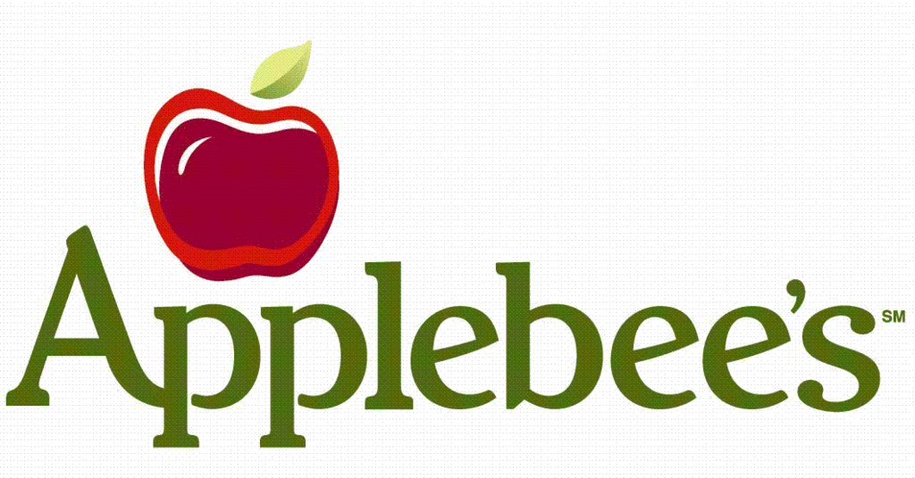
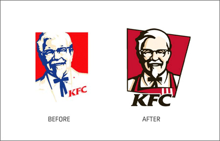
But it can be used to create good feelings too. Countless restaurants use red in their logos to make you feel hungry. Think McDonald's, Chili's, Applebee's, KFC (both before and after their recent rebrand) Burger King, Friday's, and just about every other American chain. Used well, red is powerful in all the right ways. Used poorly, too much could put your site's traffic 'in the red'.
3. Give 'Em the Green Light Green is the most soothing color in our palette. It's inviting, calming, and encourages slowing down and smelling the flowers. The right green on your website could help it act as a magnet, giving your visitors a resting place on the visually noisy Internet.
Of course, that's only good if you want people to rest on your site. If you're building a landing page, maybe you want visitors to click through to another site. Too much green on a landing page could hamper your larger goal. So while green is a very pleasant color, it's effects need to be weighed in the context of your goals.
4. They'll Call You Mellow Yellow Actually, they probably won't. I'm not sure what Donovan was thinking when he wrote his famous song - yellow is active, lively.
Used to convey positivity or caution, yellow has complex symbolism. One the one hand, the yellow ribbon is widely accepted as a symbol of hope. On the other hand, many warning signs and emergency vehicles make use of bright yellows. More recently, it's meanings have come together to symbolize a third thing: cutting edge technology.
If you want to use yellow in your design, be especially careful with it's intensity. The feel you are looking for is likely to be found in a careful choice of shade.
Too Much Info?
(by the way - if this all seems a tad overwhelming, we can help out. Web design is kind of our thing.)