Monday, November 23, 2009

What Your Colors Mean

Original Article from IntelliSites, the smart choice for web design (and SEO!)
The colors you choose for your web site say a lot. If your colors weren't chosen by a professional designer, you might be surprised what they're talking about.

I've touched on color in a previous entry, but it's worth revisiting. With this article, I'd like to delve a little deeper into some common associations we have with certain colors.

The Emotional Spectrum


1. True Blue Most people have some kind of affinity towards blue. It's used to imply things like cleanliness and harmony with nature. It's also used to communicate trustworthiness, which is why insurance companies and investment firms like New York Life, Met Life, and Goldman Sachs use blue in their collateral. Your trust is essential to their success, and they know it.

There's a downside to blue, though. We've all had "the blues" at one time or another, and we don't want to use any "blue language" (i.e. curse words) when we talk to our customers. When choosing blue for a web site design, it's important to frame it correctly.

2. Raising the Red Flag That phrase means to raise an objection or a warning about something. And red, being the hottest of the colors, can cause alarm. It's used for stop signs because to miss one is often to put lives at risk. So unless you want your visitors to feel on-edge, you've got to be careful using red.

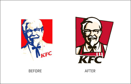
But it can be used to create good feelings too. Countless restaurants use red in their logos to make you feel hungry. Think McDonald's, Chili's, Applebee's, KFC (both before and after their recent rebrand) Burger King, Friday's, and just about every other American chain. Used well, red is powerful in all the right ways. Used poorly, too much could put your site's traffic 'in the red'.

3. Give 'Em the Green Light Green is the most soothing color in our palette. It's inviting, calming, and encourages slowing down and smelling the flowers. The right green on your website could help it act as a magnet, giving your visitors a resting place on the visually noisy Internet.

Of course, that's only good if you want people to rest on your site. If you're building a landing page, maybe you want visitors to click through to another site. Too much green on a landing page could hamper your larger goal. So while green is a very pleasant color, it's effects need to be weighed in the context of your goals.

4. They'll Call You Mellow Yellow Actually, they probably won't. I'm not sure what Donovan was thinking when he wrote his famous song - yellow is active, lively.

Used to convey positivity or caution, yellow has complex symbolism. One the one hand, the yellow ribbon is widely accepted as a symbol of hope. On the other hand, many warning signs and emergency vehicles make use of bright yellows. More recently, it's meanings have come together to symbolize a third thing: cutting edge technology.

If you want to use yellow in your design, be especially careful with it's intensity. The feel you are looking for is likely to be found in a careful choice of shade.

Too Much Info?


(by the way - if this all seems a tad overwhelming, we can help out. Web design is kind of our thing.)

Sunday, November 8, 2009

Are Your Customers Cheating on You?

Original Article from IntelliSites, the smart choice for web design (and SEO!)
That darn economy.  With everyone cutting back on everything, how will your business ever survive?  MUAH HA HA HA HA!

It's easy to blame a downturn in business on the economic climate, but, really, there are companies that are doing okay.  So, if you run one of the businesses facing tough times, it could be due to the economy, which you can't really control, but let's focus on something you can control: your website.  When business isn't good, it's a red flag that it might be time to do something about that website of yours.

Let's imagine that a few years ago, you put together a website that was, at the time, state of the art.  It's likely that your site brought in some clients when it was brand spankin' new.  However, there's about a 100% chance that some of your clients have become more web savvy since then.  And there's about a 108% chance that one of your competitors has either developed a new website or gone through a redesign since then.

So if you've noticed that your site is bringing in less business, your clients could be cheating on you with a company whose website is hotter and younger looking.

It's time to have some work done.

The first order of business is at least making sure your website is updated.  If you've gotten lax about keeping your website up to date, you are likely to turn off a lot of your customers.  Revise your contact info, making sure it's complete and up to date.  Make sure all products and services you're currently offering are highlighted.  Verify that the promos you have going on are mentioned, and any sales that are over are removed.

Once you've done that your loyal clients will have a better online experience.  But in order to draw in new clients or win back ones who have strayed, you really should consider a redesign.

A redesign can bring you a fresh layout, better graphics, a more modern feel, and better search engine rankings - in short, a more effective website, regardless of what that loopy economy decides to do next.

Monday, November 2, 2009

Ken Jennings Thinks it's Time to Redesign

Original Article from IntelliSites, the smart choice for web design (and SEO!)
Ahhh, 2004.  The year of the Athens Summer Olympics, Meet the Fockers, and a world-famous wardrobe malfunction.  It doesn't seem all that long ago, but a whole lot has changed in the world wide web in the past few years.  If your website was constructed before you first heard the song, "Drop It Like It's Hot," then it might be time to redesign.

Why?  Well, a new look can be exciting for your clients.  But more importantly, you want your website to take advantage of all the new technology and trends that have come around in the world of web design since the days of Ken Jennings' Jeopardy winning streak.  Let's look at a couple of these new tricks.

The Sparknotes Version of Your Content


We hate to be the ones to break it to you, but your website visitors are probably not devoting 100% of their attention to your site when they visit.  While your loyal client is on your page, he's probably also updating his status on Facebook, losing a bidding war on eBay, and writing an e-mail to his Aunt Maude.  (And you thought we didn't know that you were clicking back and forth between us and your fantasy baseball team right now!  It's okay - we forgive you - and we've got a couple of windows open too.)

Since web designers have now acknowledged that multitasking is a part of life on the web, they are more careful to keep the content on your site simple and easy to read.  Newly designed websites break up content by using shorter paragraphs and more bulleted lists.  If your page was designed a couple of years back, you may be losing your multitasking prospects altogether because of the text layout.

Make Your Invisible Boxes Disappear


Freshly designed web pages take advantage of looser interpretations of the "box model".  Back in the day, overlapping wasn't really possible on websites, so web designers had to essentially put each little piece of your page in its own little invisible box (think excel spreadsheets).  New technology has overcome that obstacle and made it easier to allow for elements of your page to layer over each other.  This means a lot cooler graphics and more layout options are now possible.  Translation: your website can look more cutting edge.

But...I Don't WANT a Flashy, Gimmicky, Annoying Website!

Relax.  Updating your website's design doesn't necessarily mean you have to add strobe lights and techno beats.  (In fact, please don't do that.)  An updated design can make use of new design elements and technology but still be tasteful and professional.  Think of it as making a classic recipe with fresh ingredients.  Making a classic recipe with ingredients from 2004 would result in a product that's...stale.

So if your website is past its expiration date, maybe it's time to think about an overhaul.

Monday, October 26, 2009

Are You Too Hip?

Original Article from IntelliSites, the smart choice for web design (and SEO!)
When you are coming up with a design for your company’s website, there can be a temptation to put together something flashy and trendy. After all, websites like that can be amusing to play around with.

But before you bust out all the bells and whistles, take a minute to think about exactly what you want your clients to see when they open up your page.

Your Site Should Look Like You…


There are some people in your life who just wouldn’t look quite right if they rolled up to a meeting sporting 28 piercings, a tattoo-covered torso, and a pink mohawk. Your surgeon, for one. Your accountant. Since you need to trust these individuals with very specific and important life situations, a biker jacket might not be their best wardrobe choice.

The same is true for your website. If you want your company to seem legit, you might want to skip the crazy animations and other funky extras and focus on making sure that your website sends a clear message about your products and services. You’ve worked hard to become an expert in your particular field, and you want your site to appropriately showcase the awesome business you’ve developed.

There might be brilliant attorneys out there who enjoy wearing their hair in multicolored mullets, but a lawyer who looks the part is more likely to earn the confidence of his clients.

…And It Should Look Like Your Clients


As always, you have to consider your audience. You might be able to get away with a lot of wild sights and sounds on your website if your clients are, say, eleven-year olds on a sugar high. If your client base is mostly regular, everyday adults, then a conservatively designed website is probably best for you. If there’s even a chance that your clients might get annoyed or turned off by a fancy schmancy website, you should stick to something simple and user-friendly.

The moral - Whether you like it or not, people judge books by their covers, professionals by their attire, and companies by their websites. Make sure yours is getting the right information across and making your business look good. Let YouTube handle the entertainment.

Monday, October 19, 2009

Have You Assembled your A-Team?

Original Article from IntelliSites, the smart choice for web design (and SEO!)
Lost in The Web Jungle

There are bo-jillions of great e-marketing tools out there. Company web sites, social networking sites, forums, blogs, youtube, email, etc.

All are powerful by themselves. But they’re most powerful when integrated into a complete marketing strategy.

Assemble Your A-Team

Would the A-Team have worked so well without the individual personalities of each member? No way. and I pity the foo’ who thinks his marketing can survive with a website alone (sorry - I couldn't resist).

Your goals will require a few different tools, each with it’s own role to play. Before jumping into the world of e-marketing, you need to know your Howlin’ Mad Murdock from your B.A. Baracus.

Your e-marketing tools are like employees. Your salespeople make sales, your project managers get things done, your customer service people make your customers happy. The cooks cook, the servers serve, the bartender makes drinks, and the busboys clean up. Switch things up and you’ll have cold food, weak drinks, and pretty soon no customers.

Who’s Driving This Thing?

The moral: know the strengths of your media. Your blog positions you, rallies community and helps with SEO. Don’t ask it to make sales calls - It won’t succeed, and you’ll lose a lot of your community. Your email campaigns are good for direct marketing and communicating messages. Don’t use them as chat forums. Too many email blasts will decimate your mailing list as people get annoyed and unsubscribe.

And don’t lose sight of the ultimate goal. Without something to strive for, your marketing efforts will quickly dilute.

Sunday, October 11, 2009

Update Your Site, Increase Your Sales

Original Article from IntelliSites, the smart choice for web design (and SEO!)
Your website needs to be regularly updated. I’ve said it before, I’ll say it again now, and I’ll say it as often as I darn-well need to get you to believe me.

A common reason for an update is a new offer from your business. If you’re doing some kind of crazy midnight sale for the first 100 people that show up with their pants on backwards, it should obviously go on your website.

To make the most out of your update, put together a few different techniques:

1. A Landing Page A landing page is a page on your website where you might send someone first. When you’ve got a great offer to talk about, you should have a landing page about it. It contains all the relevant details and some copy that compels people to take action.

2. A Home Page Button Right on your homepage there should be a button that leads to your offer’s landing page. This way the casual visitor to your site immediately discovers your offer, and only has to click once to learn about it.

3. An Email Campaign A couple weeks before your event, run an email campaign that builds interest in your event. Work with our eMarketing team to create an attractive frame and engaging copy, and include links directly to your landing page.

Update like this, and see your web site go from online billboard to interactive marketing mega-tool.

Monday, October 5, 2009

5 Ways to Avoid Getting Duped on Review Sites

Original Article from IntelliSites, the smart choice for web design (and SEO!)
Last week we told you about a company that forced it’s employees to write glowing reviews of it’s services on independent rating sites. The company was eventually sued, but not before some unsuspecting people got duped.

When you read reviews on rating sites, take each one with a grain of salt. Here are five grains to help you evaluate the independence of a reviewer:

Is it all positive? Good reviewers know that their opinion is valuable only if it’s honest. Reviews that don’t touch on negatives or downsides to a service may not be in touch with the same reality that we normal people live in. Be skeptical of the all positive review.

Is it hyperbole? Does the review use a lot of extreme phrases like “Amazing” or “will change your life”? Chances are good that you won’t have the same experience. Call me a cynic, but I think we’re pretty well-educated consumers, and it’s rare that a product or service can truly amaze us.

Does the reviewer have a profile? If a review smacks of insincerity, read the writer’s profile. If possible, read other reviews they’ve written and compare the writing style. Do they always write the same way? Have they written reviews that bash competitors? Both are indicators of where a writer is coming from.

Does the reviewer rate other things? A good way to measure the value of a review is to see what else a reviewer has rated. If they’ve only written reviews of this one service, there’s probably a reason (e.g. maybe the place is owned by a friend). If they’ve written many reviews and come to different, realistic conclusions, you’re probably getting more honest answers.

Does the review apply to you? When I lived in Brooklyn, I used to get my hair cut at a barber shop that served alcohol. Actually, more like a barber shop that let you serve yourself some of their alcohol. They had this little bar in the back, and you could just grab a glass of whatever you wanted. It was the craziest thing.

It was a pretty cool little spot, but let me tell you something - it was not kid friendly. It was raw, smoky, and ... well let’s just say “Not P.C.”

I would have written a good review of the place, but I bet any mom who brought her kid in for a haircut would have given it a horrible review. Fair enough. It’s up to the reader to determine which of our reviews applies to him or her.


Hope this helps.

-Dave